We’re on version 1.1 of Content SDK, so that means it’s time to get cooking! (If you aren’t embarrassed by the lack of features in v1.0, then you didn’t release it early enough.)
One of the first things I do with a new project is get Storybook running. I’ve talked a bunch about Storybook on here. Don’t take my word for it though, go read up.
Let’s lay out the game plan:
- Start with the simple Skate Park Content SDK Starter
- Install Storybook
- Create a few stories
- ???
- Profit
The first one is easy enough. Head over to the XM Cloud Starter Repo: https://github.com/Sitecore/xmcloud-starter-js/tree/main and download the whole thing. We’re going to use the
kit-nextjs-skate-park example here, since it has a nice basic array of components. Extract that to a new folder.
- Make sure you create an environment variable for “SITECORE_EDGE_CONTEXT_ID” so you can actually build the solution.
- Do your npm install.
- If you’re getting errors here…that’s not the scope of this article….
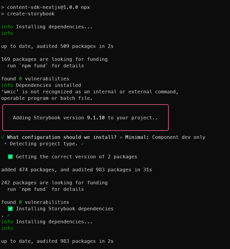
I’m assuming you made it past the initial build. Now that you’ve got your site, you need to install Storybook:
npx create storybook@latestIt’s going to ask you “What configuration should we install? I pick Minimal, since I’ve done this before. Recommended will give you some good info if this is your first time, though.
That wasn’t too hard…was it? Congrats you’ve got storybook going! (Sometimes my Terminal dies at this point…simply close it and reopen it. I don’t know why. I just tolerate it because I’m lazy)
Note: If you selected Recommended, you now have vitest installed. That’s fine, but you need to make a change to your tsconfig.js. You need to change line 21 to read:
"moduleResolution": "bundler",Or you’re going to get an error when you build. It looks like this:
./vitest.config.ts:6:10
Type error: Module '"@storybook/addon-vitest/vitest-plugin"' has no exported member 'storybookTest'. Did you mean to use 'import storybookTest from "@storybook/addon-vitest/vitest-plugin"' instead?

  4 | import { defineConfig } from 'vitest/config';
  5 |
> 6 | import { storybookTest } from '@storybook/addon-vitest/vitest-plugin';
    |          ^
  7 |
  8 | const dirname =
  9 |   typeof __dirname !== 'undefined' ? __dirname : path.dirname(fileURLToPath(import.meta.url));
Next.js build worker exited with code: 1 and signal: null
ERROR: "next:build" exited with 1.
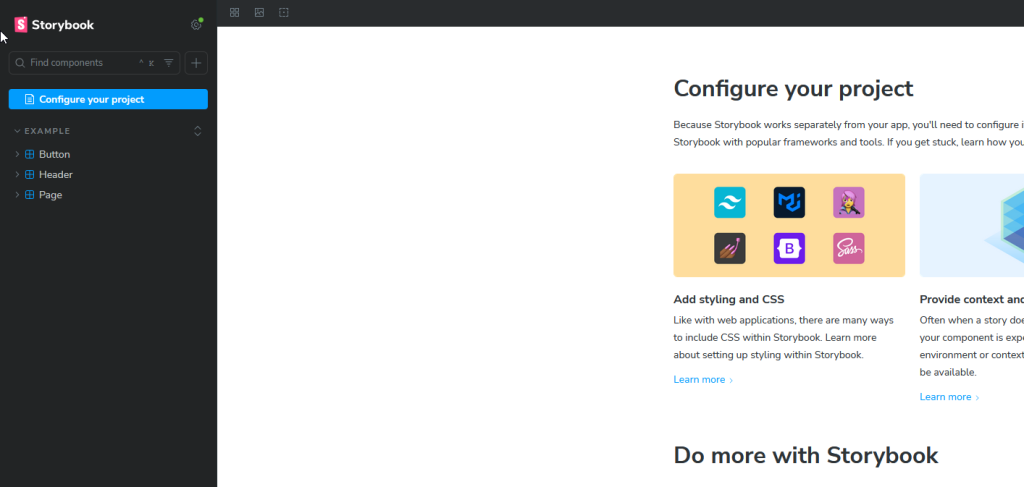
We’re good though! Now we can build the solution with Storybook in place. This is a great time to purge out those out of the box stories if you have them. Just nuke the whole stories folder under /src/
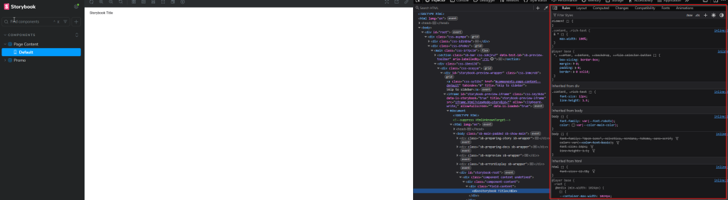
Before you deleted the stories, you should have seen something like this:
Let’s make our own story, though. Something simple. Maybe for the PageContent component. It’s just text, after all. Go ahead and create a PageContent.stories.tsx under the PageContent folder in Components. I personally prefer to keep the stories side-by-side with my components because that’s the right way to do it. You don’t put your eggs all over the house do you? All in the same spot. Anywayyyyyyy here’s the contents of that new stories file:
import type { Meta, StoryObj } from '@storybook/react';
import { Default as PageContent } from './PageContent';

const meta: Meta<typeof PageContent> = {
  title: 'Components/Page Content',
  component: PageContent,
};

export default meta;
type Story = StoryObj<typeof PageContent>;

export const Default: Story = {
  args: {
    rendering: {
      uid: 'Empty',
      componentName: 'PageContent',
      dataSource: 'Empty',
    },
    params: {},
    fields: {
      Content: { value: 'Storybook  Title' },
    },
  },
};
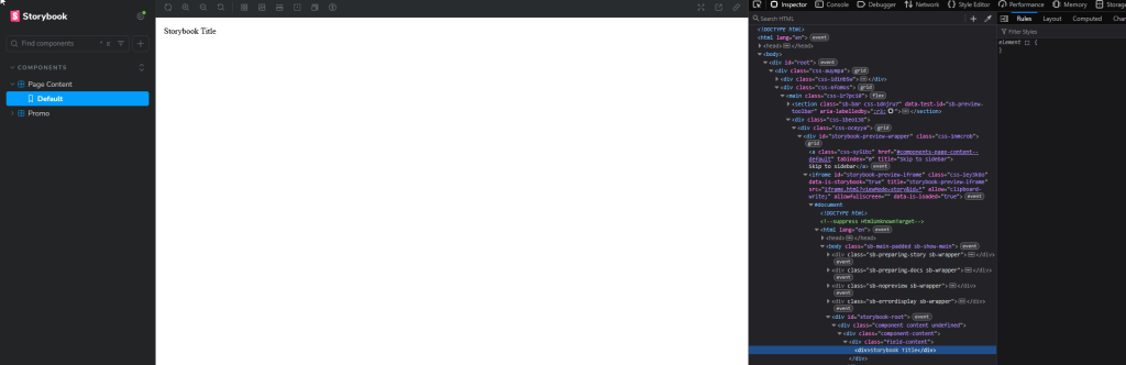
You should see Storybook update by itself and you’ll have one story on the left
It’s just text, right. But it’s ugly text, and not styled at all. We know the kit has tailwind out of the box, but how do you make Storybook use the same? That’s the preview.ts file in the .storybook folder. It should look like this:
import type { Preview } from '@storybook/nextjs-vite';

import '../src/assets/main.css';

const preview: Preview = {
  parameters: {
    controls: {
      matchers: {
        color: /(background|color)$/i,
        date: /Date$/i,
      },
    },

    a11y: {
      // 'todo' - show a11y violations in the test UI only
      // 'error' - fail CI on a11y violations
      // 'off' - skip a11y checks entirely
      test: 'todo',
    },
  },
};

export default preview;
Note the addition of line 3. We want to include our tailwind css file to the mix. Once that’s done, save it and it should reload with some CSS applied to your story.

Let’s do something a little more complicated, though. Maybe that fancy Promo with Image, some links and some text. Again, we’ll create that Promo.stories.ts in the Promo folder:
import type { Meta, StoryObj } from '@storybook/react';
import { Default as Promo } from './Promo';

const meta: Meta<typeof Promo> = {
  title: 'Components/Promo',
  component: Promo,
};

export default meta;
type Story = StoryObj<typeof Promo>;

export const Shadow: Story = {
  args: {
    rendering: {
      uid: 'Empty',
      componentName: 'Promo',
      dataSource: 'Empty',
    },
    params: { styles: 'promo-shadow' },
    fields: {
      PromoIcon: { value: { src: 'https://placecats.com/300/200', alt: 'Placeholder Image' } },
      PromoText: { value: '<p>This is a sample promo text.</p>' },
      PromoLink: { value: { href: '#', text: 'Learn More' } },
      PromoText2: { value: 'Additional promo text.' },
    },
    unoptimizedImages: true,
  },
};

export const Hero: Story = {
  args: {
    rendering: {
      uid: 'Empty',
      componentName: 'Promo',
      dataSource: 'Empty',
    },
    params: { styles: 'promo-hero' },
    fields: {
      PromoIcon: { value: { src: 'https://placecats.com/300/200', alt: 'Placeholder Image' } },
      PromoText: { value: '<p>This is a sample promo text.</p>' },
      PromoLink: { value: { href: '#', text: 'Learn More' } },
      PromoText2: { value: 'Additional promo text.' },
    },
    unoptimizedImages: true,
  },
};
Line 26 and Line 44 seem out of place at first glance. Why does the story care about the images? Well, the story doesn’t, but Content SDK does. Out of the box, there’s a bit of a nasty bug assuming you have a Sitecore Page Context. Here’s what you get if you were to put this story in place:
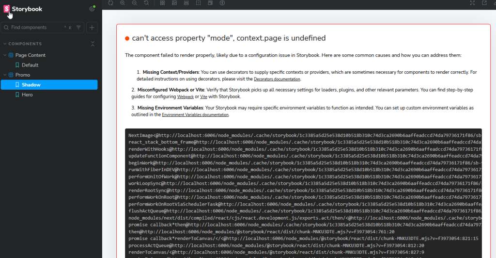
can't access property "mode", context.page is undefinedThe can’t access property “mode”, context.page is undefined was a downright pain in the ass to diagnose. It turns out that Content SDK uses the page Context to determine whether or not to set the unoptimized attribute on NextImage. Pretty lame. We can fix it though:
//Updated PromoProps

type PromoProps = ComponentProps & {
  fields: Fields;
  unoptimizedImages?: boolean;
};

//Updated Implementation
<ContentSdkImage
  field={fields.PromoIcon}
  unoptimized={props.unoptimizedImages}
  width={300}
  height={200}
/>
And yes, we need the height and width in there. Figure out a smarter way to set that, if you want to. But you do need that unoptimized attribute or things will kinda crap their bed. Since this is nullable, it won’t get set when you use the component for real.
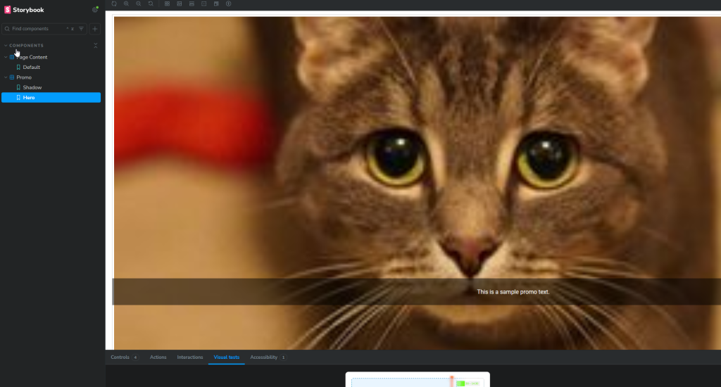
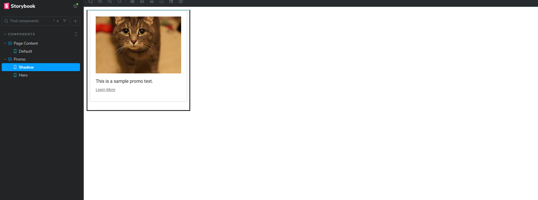
Now that you have that fixed, what’s it look like? Well, you have two stories, one for Shadow and one for Hero:

You should be happy! This was a lot to take in for a single post, but you perservered!